In preparation for my final AS Media piece I was assigned to design a front cover and contents page for a school magazine. At first, we researched several different existing school magazines in order to grasp the layout, fonts and articles regularly seen within a school magazine. Before I began working on my own magazine I carefully analysed and evaluated a variety of different existing school magazines. I found this reserch process beneficial as it enabled me to widen my knowledge on the magazine system; from draft sketches to the final product. I considered several different layouts and styles which would solely be aimed towards students; reflecting the young, fresh and funky theme desired by my demographic (reflected in my survey).
Whilst producing my school magazine I both developed and challenged the conventions and forms of a 'typical' and 'average' school magazine. I felit it important to include a real sixth form student within my fornt cover; thus appearing more realistic to the reader. I gained inspiration for my front cover layout from an existing music and fashion publication; developing good existing ideas whilst creating a unique look to my magazine. Through the use of my image on the front cover I have conveyed a certain theme to my magazine; mirroring the studying element of school life. I went through the long process of expreimenting with several fonts that I believed appeared professional while at teh same time fresh and existing; reflecting the demographic. I also looked at several existing title name fonts as I wanted to use a font which was not widely known or partnered with an existing publication. I ahve challenged the existing convention of a existing school magazines by including articles that I feel represent pop culture amongst teenagers; including debates concerning fashion and television shows as well as upcoming local events such as concerts.
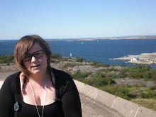
My school magazine doesn't represent any particular scoial group. Whilst taking photographs around the school ground, I felt it essential to reflect the cultural diversity of social groups within Fortismere. However, when I chose my final main image I was aware that it was only a single figure in the frame rather than a group although I know this photo is appropriate in relation to the theme of exam stress as many students revise on their own. I believe the figure's clothes and hairsyle doesn't portray Fortsimeres' 'style' in any way, due to the fact it is just the single figure.
The school will be the main distributor of my magazine; copies being left in the two Sixth Form common rooms so students can read and acquire issues when it suits them . Due to the sudience solely being Fortsimere students(information relative), no media institution would sell it as the auidence is specialised and minimal. It is possible that shops in close proximity to the school may want to stock the publication in order to inform the local community about Fortismere's events and achievements. In addition to this, the magazine could be made available at the Sixth Form open evening in January so that possible newcomers can get an insight into Sixth Form life without having the pressure to ask existing students.
My target audience are the students who attend Fortismere's Sixth Form. I hope my magazine is reppresentative of these styudents' minds; what they are interested in and what they want to find out about. An example of how my magazine is representative of my demographic is my front cover; the figure is sat at her desk with her head down, studying for her looming exams, surrounded by a sea of revision books; my magazine will be published in the fornight before AS and A level exams will be at by Sixth Form students.
Through the constructing process I have greatly developed my Photoshop skills. Photoshop is a professional software taht many magazines on the current mark use in order to edit graphics. I ahve used this software so I too can produce a publication which looks professional rather tan amateurish.
To conclude, I am very satisfied with my final front cover and contents page as they appear unique yet realistic. I especially like the way I have postioned my figure in the photo as well as the colour scheme present in the font. At the beginning of the project I was aware that the traditional Fortsimere colours of green and yellow may appear garish, however I believe that the colours fit in well with th main image; mirroring the youth and liveliness of the school. I felt it was key to use original photographs for both my front cover and contents page in order to reflect the themed visions I had for my magazine. I hope that the modern style and up-to-date content present within my magazine will appeal greatly to my demographic.
Thursday, 26 November 2009
Through my research of other existing magazines, I have found that a large proprtion use a background image as a base; layering text around the image. As is evident in the magazine underneath, most modern magazines use solely a close-up image; this layout appears to be simple yet effective in catching the reader's attention; drawing them in with the clear image and bold, precise typography. I tried out this concept with one of my own images so I could create a well thought-out final piece.
After spending a considerable amount of time getting to grips with the wide range of tools available in Photoshop, I lerant that I coud alter the appearance and style of my image by changing the brightness, tone, texture etc.
Below is a photo I have taken within the school grounds. Through using Photoshop, I was able to make the image appear brighter and the colours within, appear sharper and bolder. I made the background (bench and fence) appear faded in order to force the reader to focus their attention on the artwork visible. Using a layer mask, I was then able to crop my image to a size I felt suitable - I felt that the background (bench and fence) took the attention away from the artwork (focal pont).
Below is a photo I have taken within the school grounds. Through using Photoshop, I was able to make the image appear brighter and the colours within, appear sharper and bolder. I made the background (bench and fence) appear faded in order to force the reader to focus their attention on the artwork visible. Using a layer mask, I was then able to crop my image to a size I felt suitable - I felt that the background (bench and fence) took the attention away from the artwork (focal pont).
Initial Ideas
I continued experimenting with the software Photoshop, trying out several different effects and styles already present in the 'typical' magazine.
Experimenting with Fonts
Before producing my final design, I wanted to choose a font which I felt reflected the................... style the overwhelming majority of students desired within a school magazine (reference to the earlier questionnaire I sent out). In order to test several different and unique fonts, I used both the Photoshop fonts available to me as well as fonts which were downloable from the website http://www.dafont.com/. Once I had downloaded several fonts I felt were appropriate for a school magazine, I started to use these fonts with several different images to test which ones worked well together.
After picking an image which I felt was most suitable to publish as my front cover, I began to use a professional editing softwarecalled Photoshop. I gained a lot of valuable infomation concerning the tools and effcets available through the software. We spent numerous lessons learning how to use Photoshop to improve both the quality and appearance of an image and how to use layers when manipulating an image as well as how to combine several images with text. I put my photoshop skills to good use; taking a photo of the school's South Wing entrance at breaktime and using the layer mask tool to crop teh image professionally as well as using the eraser on my layer mask in order to discard certain parts of the image. I have learnt how to paint-out and edit my image in fine detail whilst also learning how to slect fine, intricate details using the several different lasoo tools. I ahve gone on to use the 'levels and curves' option in order to alter the proportions of different shades and tones to make my image look more exposed and of a professional quality. I ahve experimented by using various tolls within the software, such as the magic want tool and paintbrush. I especially like the diverse and eye-catching effects I can create using the 'filter' tool; it enables me to develop and enhance several elements within the image. I have learnt how to use a wide range of tools and techniques experimenting with the sotware Photoshop, all whcih will aid me to produce an effective and unique front cover for my publication.
Subscribe to:
Comments (Atom)